The new McLaren logo is actually not bad at all!
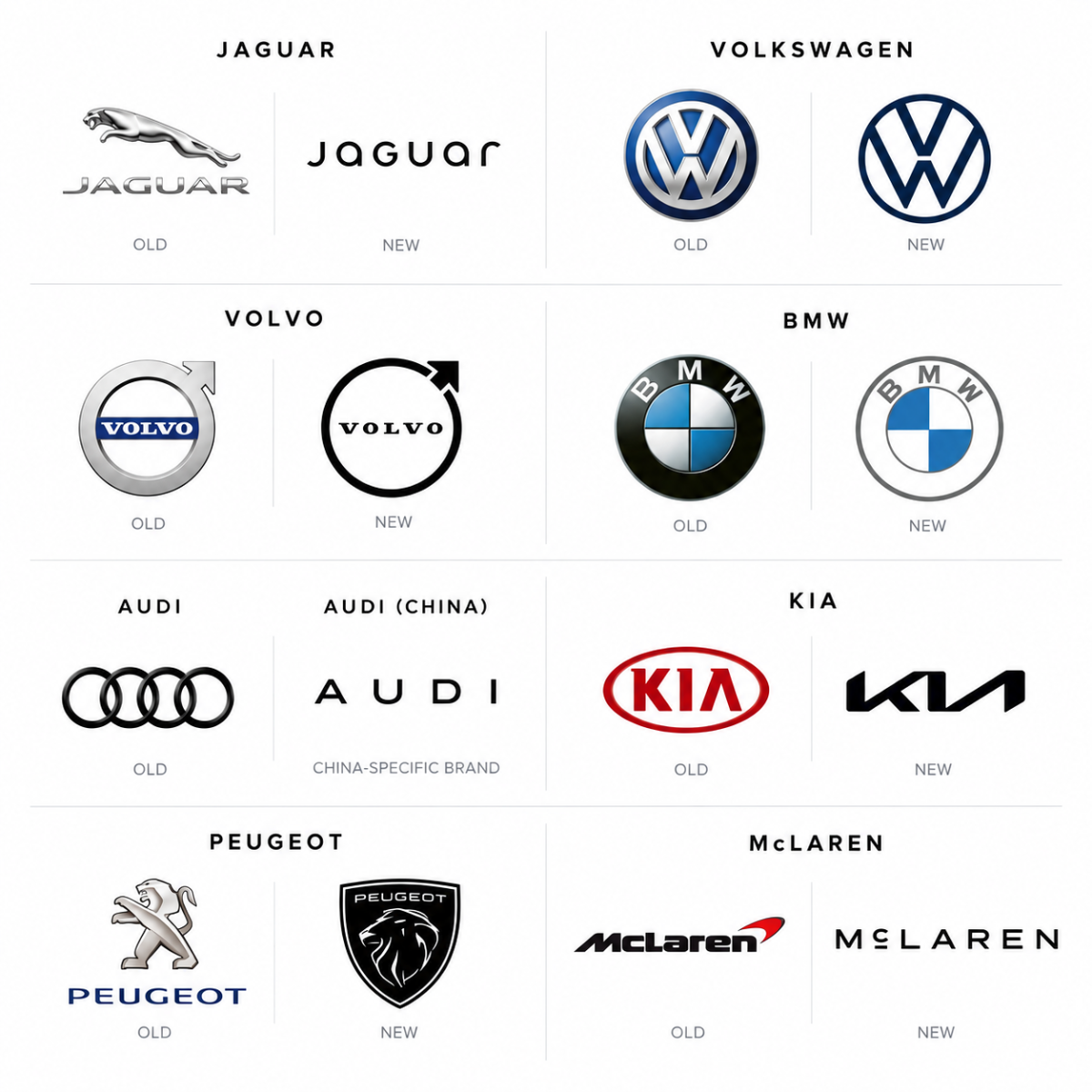
I did some digging around and realised that over the past decade or so, there have been so many automotive manufacturers who have gone down the rebranding route. Some were meh. Some were so subtle that they were barely noticeable. And one particular rebrand caused such an unrest that it became one of the most talked-about automotive brand changes in recent years.
Starting things off with the bomb, the obvious one by now: Jaguar.
The vision was a "brand refresh." The execution, essentially, sent them back a couple of checkpoints in this branding game. They are essentially restarting from ground zero.
The problem, at least from my perspective, wasn't necessarily that a brand should never change. It was how far the new identity moved away from the things that made Jaguar recognisable in the first place.
Then we have the absolute MEH rebrand brands, Volkswagen, Volvo and BMW.
Complete meh rebrands, where they essentially made the logo flatter and more digitally friendly, losing much of the 3D touch and feel that the old badges had.
And honestly, I understand why brands did this. But then, when almost everyone starts doing the same thing, how do you end up standing out?
I'm a little more iffy on Audi than the rest, actually because the China-specific AUDI brand was introduced without the four rings altogether. That wordmark is so basic and so far removed from the four rings that, as someone who has grown up seeing Audi as the four rings, it hurts my eyes and soul a little.
Then there are the brands that, in my opinion, did it right, and then some!
Kia, for one.
The newer logo is more angular, sharper and more modern-looking, and that essentially translates perfectly to their cars. The sharper design language of the cars made the new logo feel like part of a larger transformation.
Another one is Peugeot.
They essentially went back to their roots, grabbed inspiration from their 1960s logo and made it more modern without making it too minimal. That, to me, is an interesting way of approaching a rebrand.
And then we have the latest McLaren. As much as I like the new redesign, I also hate some parts of it.
Very similar to the Peugeot story, McLaren has gone back to its roots. Inspired by the sign above the McLaren family's service station. At the same time, the Speedmark, Papaya and Speedy Kiwi remain part of the identity.
While I give them flowers for not completely stepping away from their roots, I also give them stick for a couple of reasons.
For one, the typeface is quite a boring and overused one. Then, their decision to make the wordmark the dominant expression and, seemingly, underutilise the Speedmark.
The latter being my core issue. See, when you think about the speedmark, it wasn't just a logo that happens to sit next to the word "McLaren."
It had become part of the product! Look at the 675LT. The 720S. The P1. The W1. Now, look at the headlight cowl and some of the design details across McLaren's cars over the years. That visual language had become intrinsically linked to the Speedmark itself!
And McLaren's own history shows how the Speedmark evolved from its use in the late 1990s and has remained a recognisable part of the marque through subsequent identity changes.
So what happens now?
If the wordmark becomes the dominant brand expression, does the new design language eventually start influencing the cars themselves?
Will we start seeing more rectangular shapes and visual cues inspired by the new wordmark?
Because if that little shape under the "C" starts making its way into the headlights... McLaren, I sure hope not!
But what if? And then I started wondering... what if McLaren had taken a slightly different route?
What if the Speedmark replaced the N in McLAREN?
It keeps the new wordmark, but integrates one of the brand's most recognisable visual assets directly into the name.
So, I tried it.

Disclaimer: This is my own conceptual interpretation of how the Speedmark could have been integrated into McLaren's new wordmark. It is not an official McLaren design and is not affiliated with or endorsed by McLaren.